How to Pair Fonts: 5 Simple Rules and 5 Combinations That Work
Most great designs use just two fonts: one with personality for the headline, and one quiet font that does the reading work. Getting that pair right is easier than it looks. Here are five simple rules and five combinations that always work.
Rule 1: Give each font one job
Decide which font is the star (headline, logo, name) and which is the support (body text, details, prices). The star can be loud. The support should be calm and easy to read at small sizes.
Rule 2: Pair contrast, not look-alikes
Two fonts that are almost the same look like a mistake. Pair fonts that are clearly different: a script with a sans serif, a chunky display with a light serif, a handwritten font with a clean geometric sans.
Rule 3: Match the mood
Contrast in shape, but agree on feeling. A luxury serif and a playful bubble font pull in different directions. Ask: do both fonts fit the same brand words (for example elegant, friendly, bold)?
Rule 4: Limit to two (three at most)
Every extra font adds noise. If you need more variety, use different weights or sizes of your support font instead of adding a third family.
Rule 5: Test at real size
Print it, or view it on a phone. A pairing that looks great at 200% can fall apart on a business card or an Instagram story.
Five combinations that always work
1. Bold display + clean sans serif
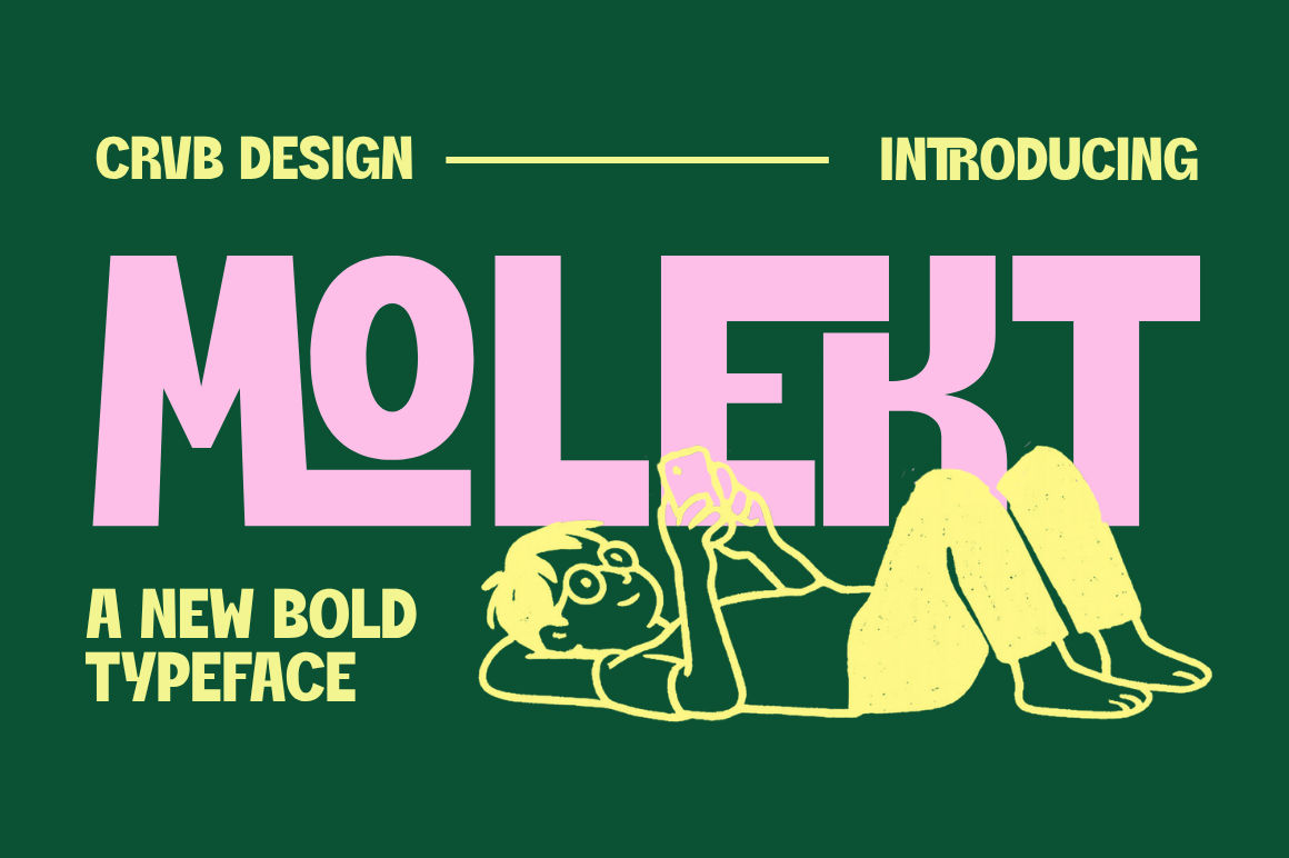
Pair Molekt, a solid, confident display font, with Phodest, a modern sans serif. Great for posters, sale banners and event flyers.
2. Elegant script + modern serif
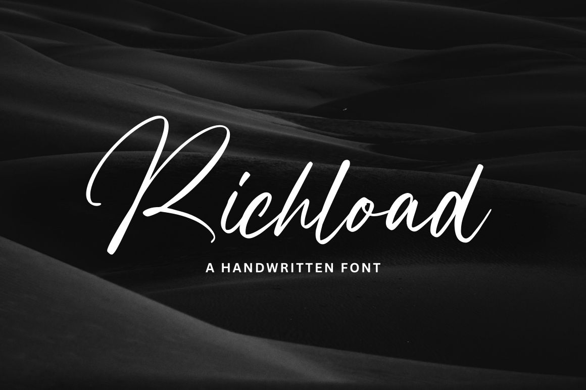
Use Richload for a name or signature and Glorase for details. A classic combination for beauty brands, boutiques and invitations.
3. Playful handwritten + simple sans
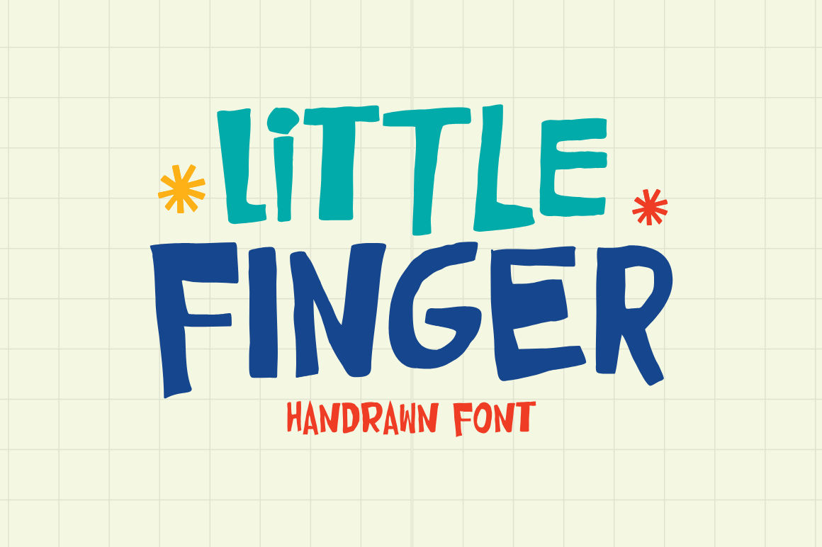
Little Finger brings doodle-like fun to headlines. Keep the rest calm with Karobu. Perfect for kids’ brands, cafés and friendly packaging.
4. Luxury serif + light script accent
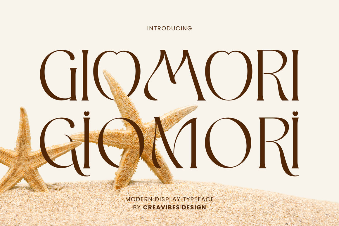
Set the brand name in Giomori and add a small signature line in Onlytime. Works for jewellery, fashion and premium packaging.
5. Brush script + bold sans
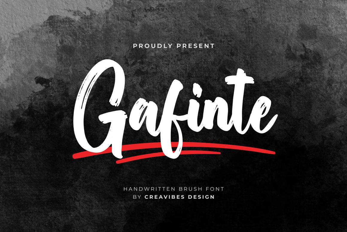
Gafinte adds movement and energy. Anchor it with a bold sans like Phodest for sportswear, merch and social media graphics.
Quick checklist
- Can I read the support font at 10–12 pt?
- Do both fonts fit the same brand mood?
- Is there clear contrast between them?
- Am I using two families or fewer?
For more help with logos, read How to Choose a Font for Your Logo. Buying a pair? Use code PICK3 to save 20% when you pick three fonts.